6 delightfully unexpected places to 'hide' brand tone of voice copy

Image via Inga Seliverstova
Who’s ready to get lowkey sneaky with branded copy?! 🙋
Before we begin, there’s one huge thing we need to get out of the way. Brand tone of voice should be everywhere. Everywhere.
There is not a single piece of copy (privacy policy and T&Cs included) that are exempt from brand tone of voice. If you’re saying something as your brand, you must say it as your brand.
That’s how this shit works, babydoll. Slip outta that tone of voice and you’ve immediately created a disharmony that makes you look inauthentic, untrustworthy, and like you don’t have a firm grasp on the little details.
So, really, this post is about uncovering the fun little areas you may have missed while writing your copy. So strap in, cowboy/girl/friend — let’s have a little brand copy fun!
1) Terms and conditions
Think your T&Cs need to be in boring-ass legalese? Nope. It may take you a long time, but you can have on-brand terms and conditions without compromising your legal standing.
If you want an example, take a look at mine. This is adapted from John McGarvey’s plain English copywriting contract via the ProCopywriters website. I took his template and made it my own — if you choose to use it, please do the same!
2) Footer copy
You know that boring shit at the bottom of a webpage or an email? The shit in light grey that hardly anyone reads? Imagine how delightful it would be to scroll down and get a different sort of message from the footer copy.
Doesn’t matter whether you’re giving an unsubscribe line, a copyright date, or a terms and conditions link, brand that shit up! Dave Harland does a fab job of this on his site, so if you want a mint example, check him out.
3) Error 404 page
The ultimate in brand copy Easter eggs! There are entire blog posts dedicated to genius error 404 pages — they’ve got something of a cult following and it’s easy to see why.
Although it’s hard not to get too wrapped up in the fun of an error page, try not to forget the use case. Your customer is lost and probably getting frustrated, so include a few helpful sign posts on the page to help them get back on their feet.
4) CTA buttons
Call-to-action buttons are a great place to explore brand tone of voice writing, but proceed with caution! Like the error 404 page, these have a job to do and not a lot of characters in which to do it. Focus on the action a click will take, keep it short, and have fun. You can find some rad (very clickable!) examples here.
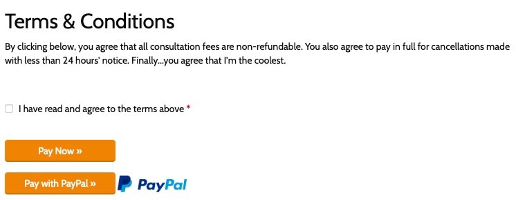
5) Confirmation tick boxes
You can get people to agree to the legal terms and conditions, but you don’t need to speak like a robot when you ask the question. Like the other UX-heavy ‘unexpected places’ in this blog post, a tick box has a job to do, so let’s not go overboard with the playfulness. Discretion is advised!
I don’t want to blow my own trumpet (or do I?) but I think I’ve done this particularly well on the booking page for my Witching Hour consultation session. I’ve done the hard work up front, but I’ve added a fun little aside at the end, just to check who’s actually reading the copy before clicking ‘accept’. You’d be surprised…
6) Image alt text
This is truly a fun Easter egg to hide because only a specific set of people will ever discover it. It’s like a secret left just for them.
Image alt. text is mostly dry and boring, if people fill it in at all, which many don’t. Not only is that a huge mistake from an accessibility point of view, but skipping your image alt text also robs you of the added SEO clout and the opportunity to get a bit playful with brand language.
When I write my image alt text, I try to capture the mood of the image or gif I’ve used. I often throw in fun comments or observations to sweeten the deal (but still keeping in mind the fact that this copy has an important job to do, so keep your playfulness in check!).
Here’s one I made earlier:

Branding is hard — I get it. If you’ve reached the end of this post and still CBA to brand your site up, give me a shout and let me do it for you. I love it.