6 more delightfully unexpected places to "hide" branded copy
Image via: Bernard Hermant
Your brand tone of voice has power, babe. But only when you tuck it into every nook and cranny of your business, across all touch points, and really commit to it.
You game? I’m assuming you’ve just nodded, so here are a few more overlooked places you can pop branded copy that, when unearthed, will delight customers. Let’s get into it…
Brand voice examples
1) Email footer
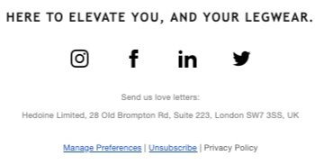
You know that grey, boring text at the bottom of promotional emails and newsletters? What if it was cute but still did the job?
Like this ‘bored of these emails already?!’ quip by The Natural Love Company…
Or this cheeky ‘send us love letters’ title over Hedoine’s registered business address…
2) Out of office
I do this all the time and relish it! If you’re a freelancer or business owner and need to set your out of office message, there’s absolutely no reason you can’t inject a smattering of personality into it.
I usually tailor mine with a few details about why I’m out of the office so people can get to know me better. Here’s an example of my standard go-to OoO message…
Thanks for your email.
I'm currently gadding about on annual leave, but don't worry, I'll be back behind my desk bright and early on [date].
Make yourself a cuppa and hang tight — I'll be back soon!
Thanks,
Emma
3) Metadata
Metadata tells search engines what each of your webpages are about. You’ll need to reserve prime place for your target keyword, but the rest could be delightful…if you wanted it to be.
4) Cookie banner
Dull, boring, annoying. Cookie banners are the swill at the bottom of the tone of voice list. They still need a shot of branding, though! Check out Dictionary.com — so apt, and slightly less annoying for it!
5) Privacy policy
Now we’re getting into the dregs, eh? Still doesn’t mean you can’t throw your brand tone of voice around. After all — it should be everywhere!
Writers’ HQ do a fab job of spreading their tone of voice thickly all over that usually-dull-as-ass privacy page. You can find it here.
6) Form field placeholder text
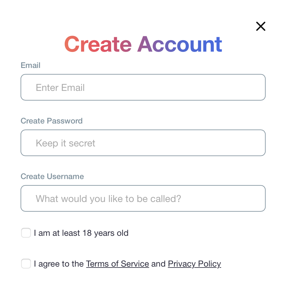
Just ‘cuz it’s a placeholder, doesn’t mean it should be dull! There are certain brands and certain situations that allow for a bit of creative play where form field placeholder text is concerned.
A recent favourite of mine comes from spicy audio app Quinn (A.K.A the absolute love of my life), who have this on their account sign up form…
Hopefully you’re feeling inspired to stuff cool copy into new, delightful places.
No? How about you hire me to do it for you — I’ve got loads of experience.


